Eat Out @ Home App Design
Project overview
The product:
Eat Out @ Home app helps people order food that is home-cooked by a variety of registered home chefs. Customers also have the option to choose and order food from a few selected restaurants. The purpose of the app is to order and deliver healthy home-cooked food with a wide range of options and cuisines to choose from. The app’s main target is working people, commuters, and students who have no time to cook nor have time to go and pick up food, but still make sure to have healthy home-cooked food. The food offers a wide spectrum of competitive pricing.
Project duration:
November 2021 to June 2022
Project overview
The problem:
Busy working people, college-going students, and commuters lack time to prepare a portion of food.
The goal:
Design an app Eat Out @ Home that allows users to easily order fresh home-cooked food that can be delivered or picked up.
Project overview
My role:
UX designer designing an app for Eat Out @ Home from conception to delivery.
Responsibilities:
Conducting interviews, paper and digital wireframing, low and high-fidelity prototyping, conducting usability studies, accounting for accessibility, and iterating on designs.
User research: summary
I conducted interviews and created empathy maps to understand the users I was
designing for and their needs. Three user groups that were identified through research were working adults, commuters for work, and college-going students who don’t have time to cook food but still can have healthy home-cooked food.
These user groups confirmed initial assumptions about Eat Out @ Home customers, but research also revealed that time was not the only factor limiting users from cooking at home.
Other user problems included obligations, interests, or challenges that make it
difficult to get groceries for cooking or go to restaurants in person.
User research: pain points
Working adults are too busy to spend time cooking food.
Very few healthy home-cooked food options are available nearby.
Platforms for ordering food are not equipped with assistive technologies.
Text-heavy menus in apps are often difficult to read and order.
Persona: Ruby Potter
Problem statement:
Rubby is a student who wants to eat healthy home-cooked food with delivery options because she doesn’t have time to cook her food in her busy learning schedule.
User journey map
Mapping Ruby’s user journey revealed how helpful it would be for users to have access to the Eat Out @ Home app.
Goal: To find home-cooked food options that can be delivered.
Paper wireframes
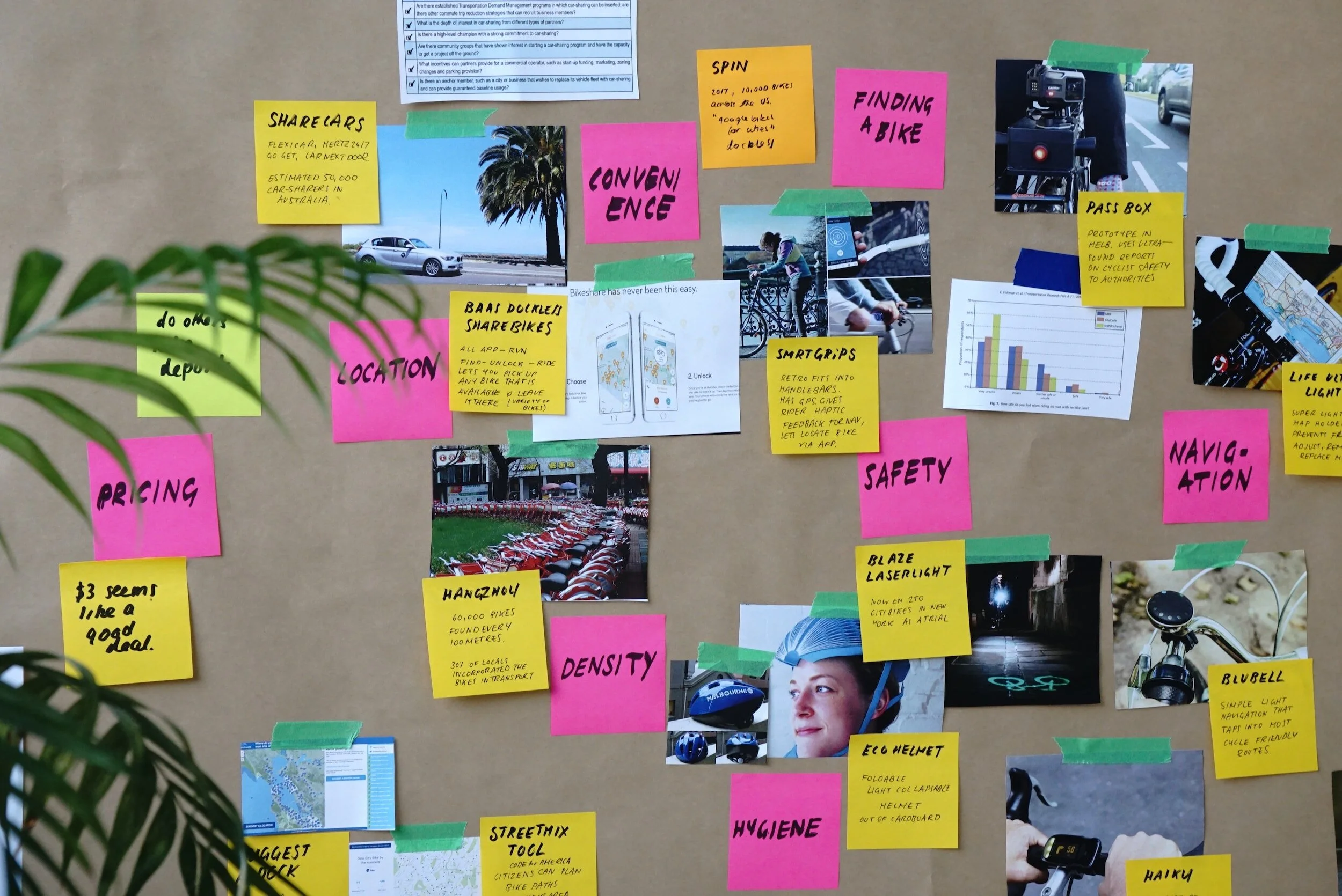
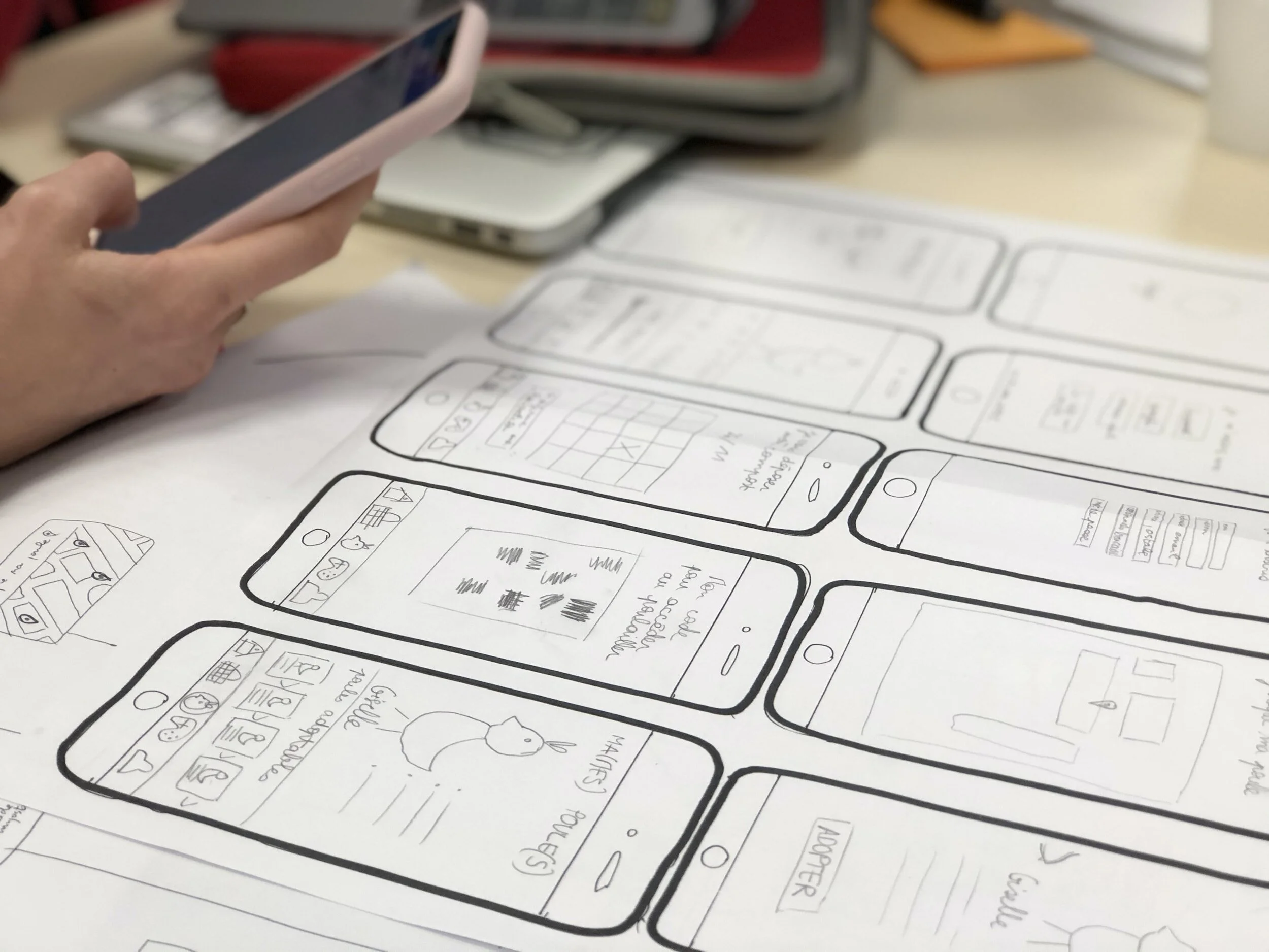
Taking the time to draft iterations for each screen of the app on paper ensured that the elements that made it to digital wireframes would be well-suited to address user pain points. For the home screen, I prioritized a quick and easy ordering process to help users save time.
Digital wireframes
As the initial design phase continued, I made sure to base screen designs on feedback and findings from the user research.
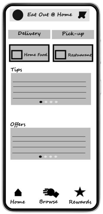
The two buttons give you an option to choose your preferred services for the orders.
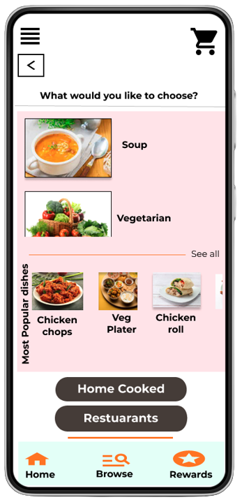
The two buttons give you an option to choose between home-cooked food and food from restaurants.
Digital wireframes
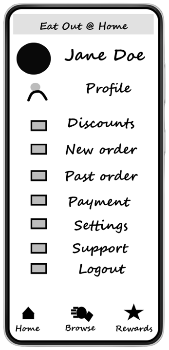
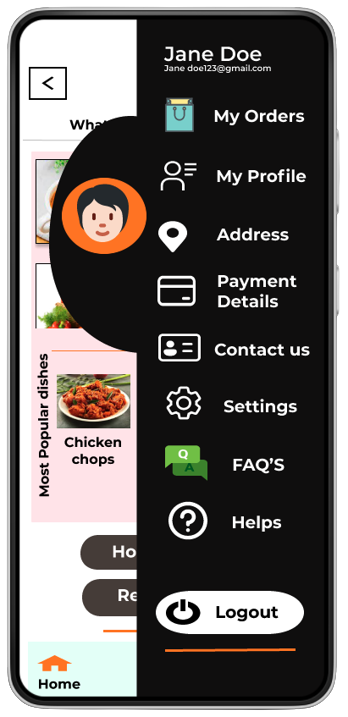
Easy navigation was a key user need to address in the designs, in addition to equipping the app to work with assistive technologies.
Easy access to navigation that’s screen reader-friendly.
Screen navigation is user friendly
Low-fidelity prototype
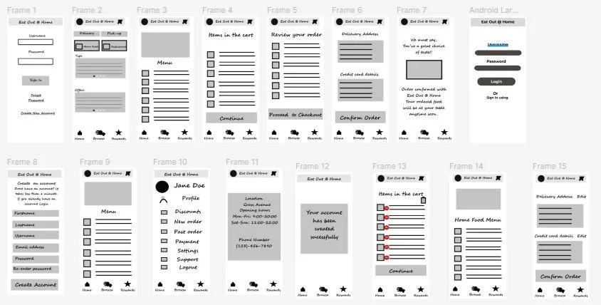
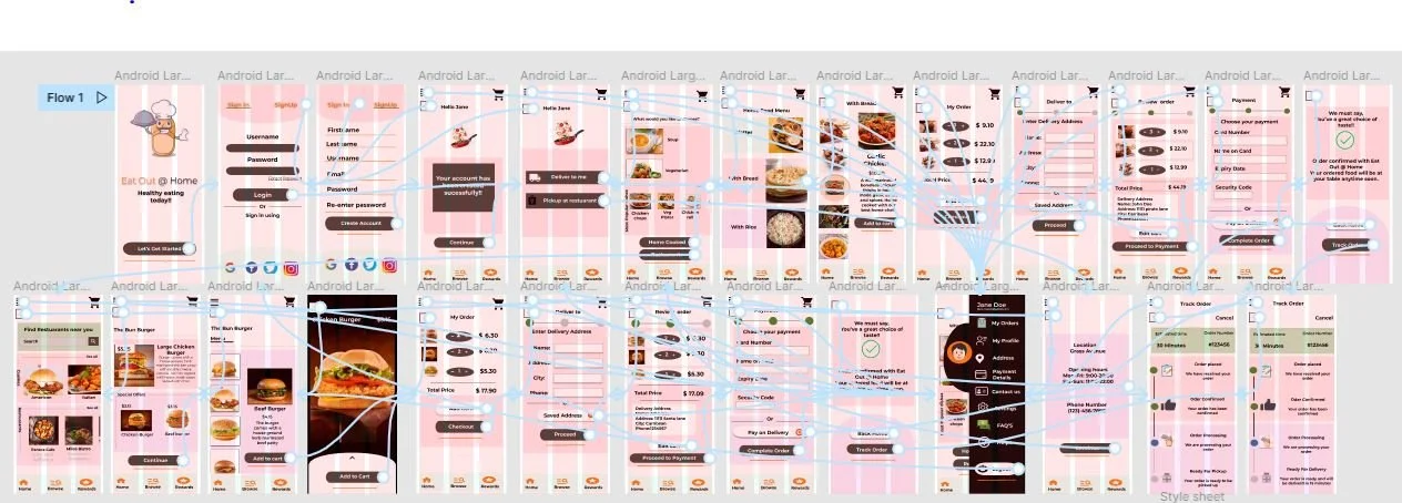
Using the completed set of digital wireframes, I created a low-fidelity prototype. The primary user flow I connected with was, creating and ordering food from home-cooked menus and restaurants, so the prototype could be used in a usability study.
Usability study: findings
I conducted two rounds of usability studies. Findings from the first study helped guide the designs from wireframes to mockups. The second study used a high-fidelity prototype and revealed what aspects of the mockups needed refining.
Round 1 findings
Users had an issue creating an account.
Users needed menu options that needed to be fixed.
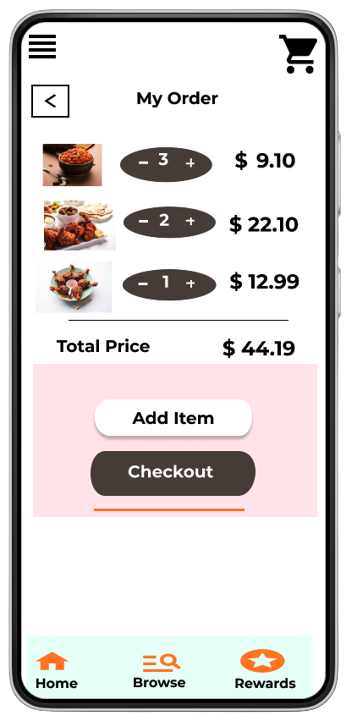
There was no Edit button in the Add to cart
screen.
Round 2 findings
The Home page with two service options needs a drop-down list menu added.
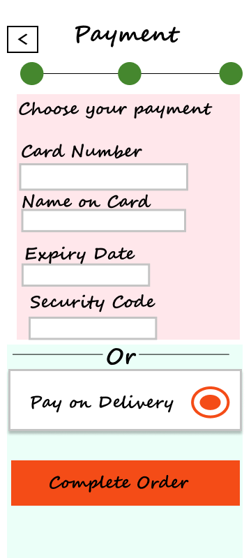
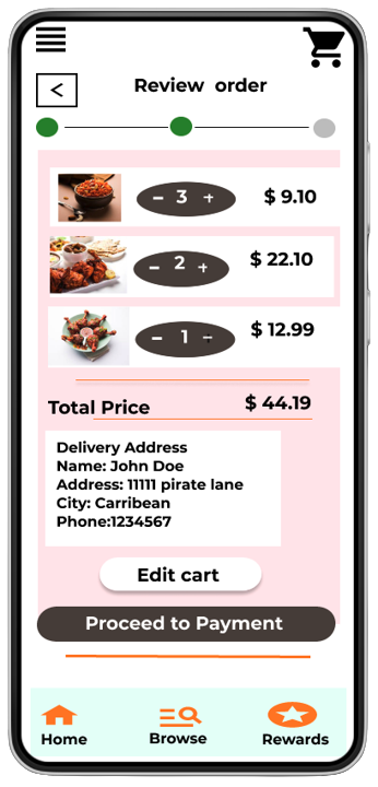
Create buttons to add an Edit option on the checkout page.
Mockups
Early designs allowed for some customization,
but after the usability studies, I felt the two service options should be on one screen and the Tips and Rewards should be on a separate screen. I also revised the design to be more user-friendly and easy to navigate within the screen.
Before usability study
After usability study
Mockups
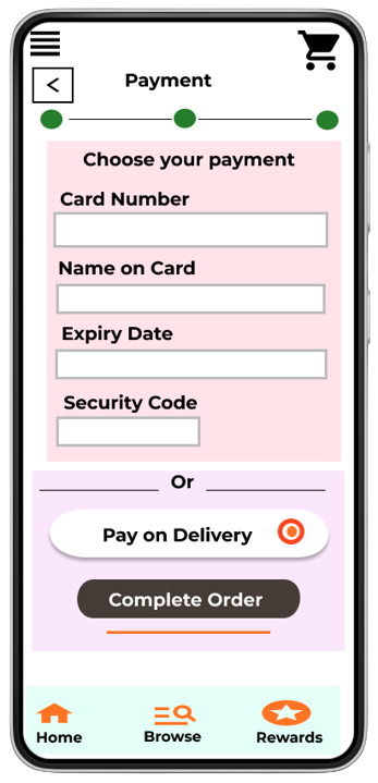
The second usability study revealed that I had to make a lot of changes in the flow, fonts, and designs. I changed the font for easy readability and then changed the color and the screen to be more clear. There were changes made to the buttons as well for easier accessibility.
Before usability study
After usability study
Key mockups
High-fidelity prototype
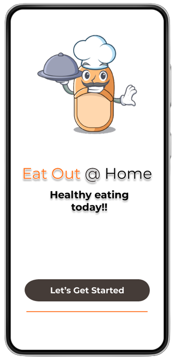
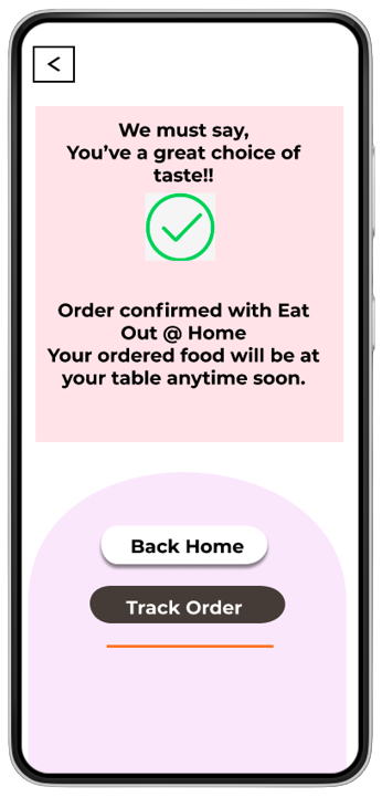
The final high-fidelity prototype presented a cleaner user flow for creating and ordering food from home-cooked menu options and restaurant options. It also meets the user’s need for pickup or delivery options.
View the Eat Out @ Home App
Accessibility considerations
Provided access to users who are vision impaired by adding altered text to images for screen readers.
Used icons to help make navigation easier.
Used detailed images for food options and restaurant food options to help all users better understand the designs.
Takeaways
Impact:
The app makes users feel like Eat Out @ Home thinks about how to meet their needs.
One quote from user feedback:
“This app has many options for home-cooked food from different home-based chefs, I would use this app as a go-to for a delicious, fast, and even healthy meal.”
What I learned:
While designing the Eat Out @ Home app, I learned that initial ideas for the app are only the beginning of the process. Usability studies and peer feedback influenced each iteration of the app’s designs. Its was fun and exciting journey where I learned a lot about designing and the detailed process in building an app.


